Health Union "HUman Side of Data" Rebrand

Theme graphic: HUman Side of Data. Built for flexibility, this adaptable framework can embrace diverse demographics and conditions with swaps of imagery and messaging.
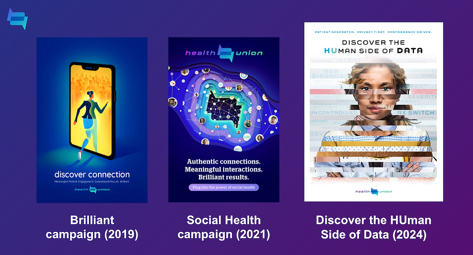
Evolution of Health Union brand
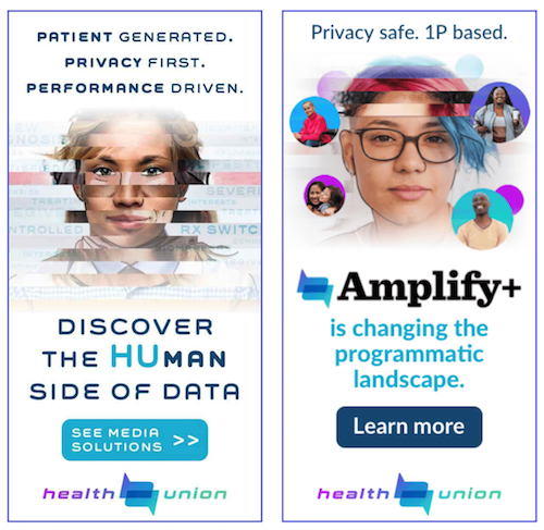
Static banners announcing campaign launch and our new Amplify+ programmatic product

Animated banner for new DEI-focused product suite
Description
“Discover the HUman Side of Data” was developed as part of a larger Health Union (HU) brand refresh as the company evolved its positioning within the healthcare data space.
Data is everywhere. And a lot of companies in the space were saying the same things, making the same claims and slowly turning into background noise. We wanted to create something that felt smarter, more emotionally human and unmistakably Health Union.
The core insight was simple: our data starts with people. Real conversations. Real lived experiences. Real human connection happening across our patient communities every day. That became the foundation for the campaign and the broader visual direction, including a stronger emphasis on the Health Union “HU” monogram. The thinking behind it was simple: you can’t spell HUMAN without HU.
The messaging intentionally moved away from cold, corporate healthcare language and leaned into something more emotionally intelligent, relatable and grounded in connection and trust. The goal wasn’t just to talk about data better. It was to remind people there are humans behind every insight.
The campaign worked on both a brand and performance level. It helped reposition Health Union as a more modern, differentiated company while reinforcing the value of our patient-powered data and community model. Banner ads tied to the campaign generated a 240%+ click-through rate, increased landing page engagement by 48% and drove a 23% increase in form fills during launch.
What I love most about the work is that it still sounded like us. Human-first. A little unexpected for healthcare. Strategic without losing warmth. That balance between emotional resonance and business performance became a major part of the broader brand evolution.